16 April 2011

19 Centennial Avenue, Brunswick West, VIC, Australia

A renovator's dream!
This charming little hellhole has been on our list of potential properties for some time now, but for some reason or another, we hadn't quite got around to writing about it until today. I don't know why, because this place just exemplifies the abandoned buildings side of his blog. The first time we went past it, I very nearly drove off the road in shock, because up until that point all the surrounding houses had been quite nice. This just hurts my eyes. Usually when you see something in this state of disrepair, it's surrounded by a wire fence with demolition orders up. But no, this one is just chillin', clearly without having seen any love or attention since it was first built. It clearly hasn't been painted since then - the original coat has just flaked off over time to expose the bare boards underneath. It seems that the plaster rendering on the upper section of the house has just fallen off, exposing a tasteful sort of wood skeleton underneath. In fact, those sections remind me forcibly of the huts I used to build in my back garden, which were made of bit of old trellis fence. The roof tiles are falling like autumn leaves, and I think the house has shifted a little on its foundations, because those windows certainly don't fit as snugly in their frames as they once might have. The garden is messy with a crumbling fence, and there is a lot of accumulated rubbish shoved down between the house and the fence.
I'm sure it was nice 100 years ago.

Now, let me draw your attention to the pictures taken through the windows. We examined these after our first visit here, and were surprised to see that there was actually some stuff inside. A fan is clearly visible, as well as some other random clutter. We assumed that the residents had just left, leaving all their old furniture to fester. I mean, seriously, out of all the houses we've collected for this blog, we were quite sure that this place was totally, absolutely abandoned. We assumed it must have been sitting there for years with just that horrible, fetid old caravan for company.

That poor, poor fan!
Here's why we should never assume anything ever again. Recently, we drove past this place at night. We had been keeping our eyes peeled, since we thought it might be quite hard to find in the dark. Well, this wasn't the case at all. You want to know why? Because there was a light on. A proper fluorescent light, not the torchlight of vandals or squatters. The place is actually in use. I couldn't fucking believe it. This is probably the closest we've come to finding something worthy of a Dot Dot Curve rating, and it turns out that people actually USE IT, perhaps even live in it. Out of all the places we've found for this blog so far, this was one of the few cases where we didn't even have a flicker of doubt about the "abandoned" status we gave it. Even if this is just someone's workshop rather than their residence, you'd think they'd at least fix the roof. I would be genuinely worried about this place staying up in a high wind, so I certainly wouldn't leave anything I'm working on in there unattended. In addition to that, it looks so easy to break in to. All you'd need to do is tap on the wall and you'd probably make a gap big enough to crawl through. I'm not even going to think about someone actually living here, but after seeing that light on, it's a troublingly plausible thought. I hope that they move out before that wonky chimney falls through their bedroom roof!

You win the "worst house on this blog" award. Well done.
To be honest, I would rather live in that caravan for a year than spend a week in that house. You might not quite understand how momentous that is, but I am massively ill-disposed towards caravans. They creep me out and they're dirty and horrible and get in the way while you're driving. Caravans are the crows of the mechanical world. I hope that helps you understand how bad these place actually is. I hope for the sake of everyone living on that street that the termites and the elements get rid of this place sooner rather than later. Perhaps then the mystery residents can move somewhere nicer - I think even this would be luxurious compared with their current wreck.

Rating: Cellar floor.

12 April 2011

A real estate translation guide

Besides critiquing whatever properties - for good or bad - catch our eye, one of our favourite past-times here at MYL is to flick through real estate magazines and have a right old laugh at some of the shonky claims and horrendous writing. In the spirit of this, here is my guide to what the blurbs really mean, because if we know one thing about real estate agents, it's that they are full of shit and often are paid to hock off houses that they think are a total load of shit.

What they say: "Under instructions from state trustees."
What they actually mean: Somebody died here. The curtains, wallpaper, and carpet date from about the same year as Cliff Richard and are even more undesirable. James May probably has a shirt that looks like this house's interior, but unlike James May, the house can't quite get away with it any more.

Bet when 39 Barry St comes up for sale, it'll be a "renovator's delight"!
What they say: "Exciting options to renovate", "renovator's delight", "so much potential", or any variation upon this theme.
What they actually mean: It's shit. It's so shit that the agent can't even think of an admirable quality to highlight.


What they say: "Continuously owned by the same family since [any decade prior to the Cold War]."
What they actually mean: We're sorry about the hideous carpet and all the wares and keepsakes and generic knick-knacks that will undoubtedly catch your eye during the open home.

What they say: "In a league of its own", "something different", and "a rare opportunity".
What they actually mean: Just like everywhere else. We're pretending it's unique so that you'll be interested.

What they say: "Feature wall."
What they actually mean: We're trying to re-cast the most architecturally abhorrent aspect of this place as something somehow desirable and exclusive.

10 April 2011

176 Barkly Street, St Kilda, VIC, Australia

Back in the day when I was a poor undergrad student, I looked at quite a few properties in the desperate quest to find somewhere cheap, inexpensive, and in a vaguely decent location (emphasis on "vaguely"). I looked at some pretty horrendous properties in that time. It's amazing what real estate agents and landlords get away with asking for properties just because they happen to be a couple of blocks from a mediocre beach or across the road from a railway station or happen to fall within the formal boundaries of a poncy suburb. But 176 Barkly St takes the cake for being the single worst - and single most memorable - property I had the displeasure of setting foot in on this entire quest.

Oh-so-inviting entryway, where you can be bashed in seclusion.
I wish I could show you inside.  If the pictures of the exterior make you think it looks reasonably dank and dingy, you're on the right track. It's just so dark on the inside. Some rooms looked like a ray of sunshine had never once passed through the window; it was a bright spring day outside, but I felt like I was in England on a stereotypically drizzly winter's day. I remember the rooms at least seemed to have fairly high ceilings, a quality i quite like, but otherwise ... sweet jesus, the floorboards and the aged walls were dark enough to emphasise the drab, soulless feel, and the fittings in the kitchen and bathroom looked barely hygienic and barely functional. The sort of fittings that, in general, had disappeared before the Soviet Union did.

One of the windows has recently gained a tag. Charming.
On the outside, well, the design betrays a lack of imagination. The graffiti scrawled on the window actually somehow adds to the building, that's how meaningless and drab it is. There was graffiti by the entryway that stayed there for years - although gone now, it lasted a good couple of years at least. The landlord clearly had little concept of maintenance. The fact the building was so clearly vandalised was just a reminder that in such a miserable and dark corner of St Kilda, you too were likely to be vandalised on your doorstep. Especially on a Friday night. This building is literally just around the corner from the happenin' block of Acland St, and that is why the real estate agent was asking ...

... wait for it ...

I can understand why it's hidden behind trees! Bonus ugly building at left.
One hundred and eighty dollars a week for this stinking sack of shit. There's a pub a few houses down, a supermarket right across the road, you're about two minutes from one tram line and two minutes from another, strolling to the Palais Theatre or Luna Park is effortless, and it's just another minute on to one of the most crowded beaches in Melbourne come a sunny weekend. Yet even if that sort of location sounds awesome to you (I find St Kilda a bit crowded and commodified myself), you'd spend every day living there overcome by a feeling of being utterly ripped off. It's highway robbery to demand $180 for somewhere unfit to house a dog. Actually, I don't like dogs and would quite happily house a heap of them there, but I'm a twat.

Google Streetview, prior to demolition.
The good news, as the pictures show, is that the place seems to have been gutted and is in the process of demolition, or at least a much needed rejuvenation. I hope it's the former, because even if you completely rebuilt this thing inside, I'm pretty sure there is a forcefield across the windows that prohibits sunshine from entering.

Rating: Condemnable and can't be torn down soon enough.

06 April 2011

243 Mansfield Street, Thornbury, VIC, Australia

When I first came across this place, my immediate reaction was to rip into it for being another ridiculous example of the modern architecture I hate so much. However, that was a little while ago, and I've had time to think about it and realise that for once, I might not be writing a hate-filled rant about something modern.

Yes, it's a funny shape. It's painted in colours more suited to a Teletubbies set. It doesn't have a roof. It has racy angles all over the place. It shouldn't work! But it a weird way, it's actually kind of endearing. I mean, I would be pretty happy to live here. With the right maintenance, those bright colours will stay bright and attractive (now I sound like a washing powder advert), and let's face it, no-one would ever get lost looking for your house. The only trace of mushroom-coloured paint lies around the front door, on a surface which looks troublingly like corrugated concrete from a distance. Still, that is a much better effort than pretty much all the other new places around here have made - generally, the only deviation in their "mushroom" paint scheme is a nice stripe of black or brown. I'm very impressed.

To be honest, I think the biggest flaws with this place are not with the house, but with the garden. Firstly, that fence has to go. Sure, it's not quite as bad as those fences around here that look like level crossing barriers, but it's pretty bland all the same. It looks more like a barrier at the side of the road to stop unruly children dashing out into the traffic than a tasteful residential fence. And the garden needs some serious work. It's bright enough as it is, but some nice flowerbeds would ensure that this thing could be seen from space! The trees on the left need a serious trim - surely if you're going to paint your house that bright, you're going to want people to see it. Still, unlike the flaws you find in most modern places, these things are all very easily fixed. Perhaps when this place gets leased, the new tenant will fix it up a little.

For the first time in the history of Mow Your Lawn, I am quietly optimistic about a modern place. A truly momentous occasion.

Rating: Kind of quirky but not too offensive, really. Probably equates to a lick o' paint.

30 March 2011

Waiotira railway station, Waiotira, Northland, New Zealand

All photos (apart from one obvious exception) taken by me, April 2010.

Now, as much as I love slagging off hideous architecture, I don't want Mow Your Lawn! to get too bogged down in rants like the sort I just published about the Elizabeth Tower Hotel. So I thought I would fairly quickly follow it by showcasing the other side of the blog: the fascinating world of derelict and decaying man-made structures. Today's subject is the very decrepit Waiotira railway station in the middle of nowhere, lost somewhere in the rolling hills of the Northland region of New Zealand, a couple of hours out of Auckland.

The old back platform is in the foreground. If you can tell.
Waiotira station is located on the last section of the railway between Auckland and Whangarei to be opened. A rough-and-ready kind of freight service operated from 1923, but it wasn't until late 1925 that passenger trains began passing through here. But soon Waiotira was a railway junction, with a branch line leaving this station for Dargaville to the west. Between the mid-1940s and the mid-1960s, this was a busy station where trains from Auckland to Opua or Okaihau via Whangarei met local services that ran between Waiotira and Dargaville. It had two platforms, one for the main line and one for the Dargaville trains, a station building, and a busy goods yard. But that's all history.

Waiotira, June 1985. Credit: jeffpylenz; source.
Go to Waiotira today and try to imagine what it was like around 1950. Both railway lines are still open - just. They are on the brink of closure. As for the station itself? It's pretty eerie here in Waiotira really. It's hard to even get a sense of how this was once a busy junction, with passengers changing trains and goods being trans-shipped. Just look at that lonely platform; it's fading back into the landscape, covered by grass in an even more substantial way than Dargaville station. The only reason a train would stop here is so that locomotives on freight trains between Dargaville and Whangarei can swap ends. Passengers have not boarded regularly scheduled trains here since 1976, and the platform is now so overgrown and inaccessible that even a special excursion could not use it. It's hard to believe that even in June 1985, there was a decent-sized, well-painted, and not unattractive building sitting on that platform (see photo above right). If you told me nobody had set foot on it since that last regular service in 1976, I would have believed you.

The old goods yard, with Waiotira township behind.
The yard is basically a thing of the past. The main line and a short loop are still useable; a third track is in place but looked to me like it could no longer be used. The rest is gone. There are no facilities; the back platform has long since been taken up; there are certainly no wagons being dropped off or collected by passing trains. You have to use your imagination to recall a time when wagons were shunted busily, local produce was loaded, and much-needed supplies were dropped off. Waiotira was more than just a couple of hours away from Auckland in those days, and this station was a lifeline. Now, it's nothing. The only life is a signal protecting the branch to Dargaville. Even those tracks are losing their glimmer.

Well there's SOME platform surface left!
Like many country New Zealand towns, Waiotira nowadays is barely more than a dot on a map. There are just a few houses, and it's little wonder that the railway station building has not been preserved or that the station precinct has become so derelict and forgotten. It is, in a way, symbolic of how rural communities are fading away in many places. It shows how in this part of Northland, like so many other regions, being away from the State Highway and being stripped of your railway facilities one-by-one (first the expresses, then the slow passenger trains, then the freight) can be ... perhaps not a kiss of death, but a key part of the slow decline of rural areas.

Rating: Vacant, which I think translates to about Unpleasant on our oh-so-formal rating system.

Update: 786-798 Elizabeth Street (Elizabeth Tower Hotel), Carlton, VIC, Australia

Well, well. Early this month, Charlotte wrote about the Elizabeth Tower Hotel and its decrepitude. She noted that it was subject to an application by the University of Melbourne to demolish it and construct the Peter Doherty Institute for Infection and Immunity. Today's good news is that Melbourne Uni has succeeded in this application, as reported today in The Age.
 
Soon to cease being a blight upon the skyline.
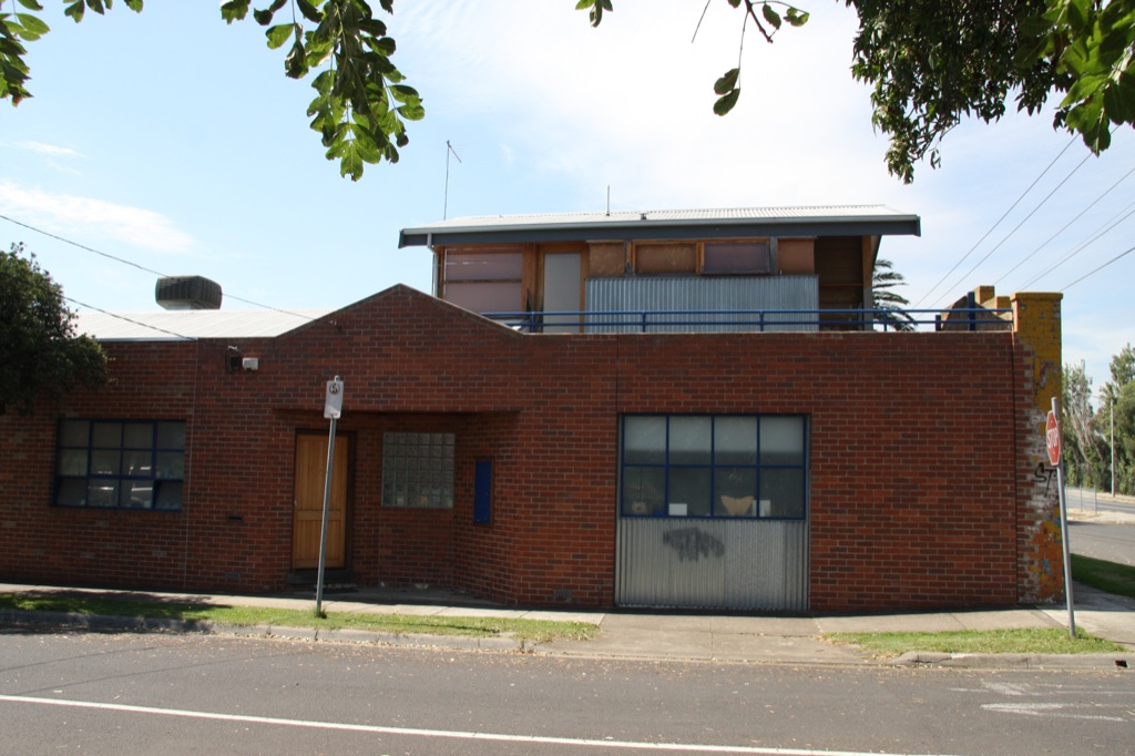
What is worth noting is that for some reason, almost inexplicable to me, this building is heritage listed. Some people, judging by comments on that article, seem to think it has some sort of aesthetic merit worth preserving for future generations. I personally would go even further than Charlotte in condemning this monstrosity of a building. For full disclosure, I am a historian, my work has occasionally led me to dabble my toe in architectural history, and I am usually the first person to come out and bat for heritage protection. I am continually saddened by the way many cities have demolished their history, and I am infuriated by how many new buildings have been erected with the facades of their predecessor as some sort of tokenistic concession to history. However, this building is truly and utterly discardable, and the only argument I can possibly fathom in favour of its retention is as a warning to future generations not to replicate the failings of some 20th century architects.

The spiral staircase is cool, I will readily concede that. However, a single staircase is not enough to save a hideous building. If you take away the staircase, you are left with just another 1950s highrise lacking any charm or personality whatsoever. It is an exceedingly plain, bricky building with rows of generic windows littered with unbecoming, mouldy old air conditioning units. I never ventured inside myself, but by all accounts the cleaning staff had long since lost the battle with half a century's worth of accumulated grime - and, perhaps, had lost the will to live too.

I don't know where Paul Roser, National Trust conservation manager, gets the following ridiculous notion, as quoted in The Age, that the decision to demolish this building is "another part of the steady attrition of significant buildings in the city".  No, Roser. Besides a staircase of middling importance and effectively no historical notability (wow a tall spiral staircase, nobody's ever seen that before!), there is absolutely nothing significant about this building. It is not a landmark. No tourist is going to come and see this. Locals walk past it without a second thought. The only few people who could possibly give a shit are the same bizarre people who continue to encourage wretched architectural fads that are making Melbourne and other cities uglier. The National Trust has much better things to worry about than some meaningless and charmless inner city hotel that, the moment it's knocked down, won't be missed by anybody.

Time for the Elizabeth Tower Hotel to check out of Melbourne.
Of course, I have utterly no confidence that the University of Melbourne will build a quality building in its place. The uni's latest major project, the new Economics and Commerce Building, is a monument to blithering stupidity, as I'm sure I made abundantly clear in this particular rant. However, regardless of what goes up in place of the Elizabeth Tower Hotel, the Victorian Civil and Administrative Tribunal has made the right decision to bowl it over before it festers any longer. Councillor Peter Clarke, again quoted in the aforementioned Age article, claims that this decision illustrates how VCAT is "out of step with the broader views of the community". I think the only person out of step is you and your malfunctioning eyes, Clarke. The skyline will be much better upon the removal of this damning legacy to 1950s architectural follies.

Rating: This decision does not impact Charlotte's original rating of Condemnable, which I endorse.

29 March 2011

234 - 240 Barkly Street, Footscray, VIC, Australia

I haven't done a blog entry for a while, and I apologise. I've been stuck doing some crappy assignments which took even longer to submit than they did to write, so I'm a little bit on the angry side too. However, that "little bit on the angry side" changed immediately to ABSOLUTE FULL BLOWN RAGE when I remembered this place. It's very lucky that I didn't have a fatal accident when I spotted this, since for a moment I was so repulsed that I forgot how to drive. Then I just wanted to drive as fast as possible in order to get away from it.

That's your HOUSE? Sorry, I thought it was the carpark.
This monstrosity is not a gigantic multi-storey carpark, though you may be forgiven for thinking this is the case. No no, people actually live here. Cirque Apartments, if you believe the blurb of the estate agent, are a "defining focal point of Footscray’s vibrant re-vitalisation". Oh! I'm sorry, I thought a gigantic Lego man had just taken a shit on the footpath. Focal point, that's what they're calling it these days! Now, I know these photos were taken on a very gloomy day. Perhaps it might look better on a sunny day? Well, here is the artist's impression of the place.

Nice job on removing the dingy shops surrounding it, too.
Ugh. Sorry, even with optimistically blue sky and a nice yellow car out the front, it still looks like it's made of plastic. In addition to that, see how lovely and clean it looks in the artist's impression? Well, when we drove by, the place was not actually finished. In the short period of time that this place has been standing, it has already gathered that awful, stained look that concrete buildings are so susceptible to. I sincerely hope that they cover the bare concrete - I know it would just be a case of polishing a turd, but at least they'd look as though they'd tried. However, I'm not optimistic about the chances of this. 

Looks more like a factory from the front.
This is not a "showpiece of inner-city living", as the estate agent (who, incidentally, needs to learn to use his space bar) may claim. Showpieces are nice things that you should be proud to show off. If I lived in Footscray, I'd want to stuff this into a cupboard like an unwanted gift every time a visitor came through. As far as houses made out of building blocks go, any five-year-old could design something more attractive than this. Apparently this place will "accommodate a variety of lifestyle needs". Oh yeah, my lifestyle needs totally require me to live in a cold, grey concrete box and hate my life every moment of the day. I'm sure that's what they were going for. That's a stupid statement anyway - what lifestyle needs could this place possibly accommodate than any other house couldn't? They must really be stretching.

This needs to go. Word of advice to the estate agent - if a multi-storey carpark is your "grand vision", you really need to aim higher. At least build a proper roof - that staircase effect just doesn't cut it.

Rating: Condemnable, though this could change when the place is complete, for better or for worse.

27 March 2011

69 Albion Street, Brunswick, VIC, Australia


Sorry for the lack of posts over the last few days - it's a busy time, so we may not quite be able to maintain daily posts. However, today I bring to you a place that just baffled me.


Initially, it just seems like a run-of-the-mill example of a house suffering from a lack of maintenace. It's the bread and butter of Mow Your Lawn!, the sort of thing that I casually swore at on the day I coined this blog's name. The paint is peeling, flaking, and just generally decaying; this is so extreme on the side that you would be hard-pressed to tell what the wall's original colour even was. The crappy front fence is an aesthetic displeasure that belongs in front of an underfunded school rather than a house; it has been knocked over at right, and appears to have been left knocked over for so long that the foliage has adapted and grown around it.

"There ain't no awning here and there never was!"
Worst of all, the awnings that used to be over both of the front windows at the front ... are no more. There are just a couple of bits of tatty old splintery wood poking out from the walls above the windows, indicating where awnings used to be. Weeds have even started to make a home on the walls, not in the majestic way of ivy but in the ragtag way of, well, weeds. This place isn't quite coming apart at the seams like dear old 39 Barry Street, but it looks like that is what's in its future.

... then you notice the front lawn. Go back to that first photo. Yeah, that's right, the lawn is neatly mown. The flowers seem to have been given some care. The shrubs are in order. The letterbox is clean. The tree at right may be shrouding one side of the house and there may be growth settling on the wall and the remnants of an awning, but the garden itself is perfectly orderly. The house may be a disgrace, far away from its glory days, but the people here have actually mown their lawn! The fence may be kicked over and the plants growing around it, but the plants themselves are being helped to thrive!

Well the shrub doesn't seem unhappy about having a fence foisted upon it.
We can't make heads nor tails of this. While the garden is neat, it's not a showpiece; it's hardly the garden of somebody so obsessive about their plants that they've put all their love and affection into it at the expense of their home's structural integrity. The best explanation I have is that they really couldn't give a shit about maintaining their house or their fence, but they have an outright fear of snakes and spiders and don't want an overgrown front lawn that would host such things. Otherwise, what? This house seems to me a bit beyond the "oh we'll fix it up when we've got the time/money/inclination".

Rating: That neat front lawn means this place just falls on the Damnable side of the Damnable/Condemnable divide.

23 March 2011

305 Albion Street, Brunswick, VIC, Australia

Update, 28/11/2014: We have received concerns that some comments on this entry are defamatory of individual Walshe & Whitelock agents. Comments with defamatory content have been deleted. This blog is no longer actively monitored, so we have chosen to close comments to avoid the possibility of further defamatory comments. We apologise for this; if you have an opinion you wish to share on Walshe & Whitelock's business practices, please post it on your own blog or Google Reviews or elsewhere - and make sure you don't defame anybody!

If you're a regular reader of this blog (and if you're not, why not?) you will almost certainly be familiar with the concept of "Walshe and Whitelock" by now. For those who may not be, it is the name of an estate agent that always seems to be hocking off the most miserable properties, which are usually massive, made of bricks in that awful 1960s brutalist style and have about as much character as a dog turd on the pavement. They usually provoke a similar reaction to a dog turd on the pavement, in fact. Anyway, I thought I'd seen my fair share of Walshe and Whitelocks around here. I almost thought I was becoming desensitised to them. Then we stumbled across this quintessential example of hideousness on Albion Street.
The picture possibly makes it look better than it really is.

This thing embodies the Walshe and Whitelock stereotype to the most ridiculous extent. Everything that could be potentially wrong with it IS in fact wrong with it. First off, the design (or lack thereof). Enough red bricks to last a lifetime? Check. Complete lack of a roof to cap off the "shoebox" design model? Check.  Crappy attempt at adding variation with the white bricks around the windows? Present and correct. Something this soulless shouldn't be allowed to exist, especially in an area which is otherwise most aesthetically pleasing. With regards to the right hand side of the house, I would usually say something like "chop down your trees!" But in this case, the massively overgrown vegetation is more of a blessing than a curse. At least I only have to look at half of it this way. I feel sorry for the residents on that side though - we all know Walshe and Whitelock properties are known for their dinginess, and this shrubbery over their windows would exacerbate this tenfold.

Security entrance! Central courtyard!
Now, you see that open door there in the middle? That's another one of Walshe and Whitelock's famous "security entrances", as seen previously in this entry. It is always open, even in the depths of winter and in the middle of the night. As a matter of fact, I'm not even sure there is a door there to close in the first place. It would make sense given Walshe and Whitelock's general stinginess. It would be very easy to get in here, and judging by the abundance of mailboxes, there would be a great variety of places to rob. That's if any burglar can bring themselves to set foot in this place, though. Even burglars have standards.

The middle of the complex seems to open out onto a courtyard of some sort. Judging by what we can see in these pictures, that certainly doesn't look like somewhere I'd like to spend my afternoons. The balcony that faces it looks mouldy and possibly structurally unsound,  too. I bet it was some optimistic attempt at a garden or some other feature, which lasted about a day and then degenerated into weeds and muck. In fact, I'm probably being optimistic. It's probably just where they keep their rubbish bins.

What's behind the trees? You don't want to know.
There shouldn't be any excuse for this. Seeing places like this just depresses me, so I can't even imagine what it must be like to actually live in one. Are people really this desperate? I guess so, given the exorbitant amounts that Walshe and Whitelock get away with charging for the rent. They know that they can offer a tiny, boxy, dark apartment that hasn't seen a paintbrush or even a duster this side of 1970, and some poor student will still settle for it at $300 a week. In addition to that, it breaks my heart to think what lovely Victorian home stood here before the developers massacred it in the 1960s. The only redeeming feature I can pick about this place is that at least it's used. Can you imagine how many thousands of times worse these places would look if they were abandoned? I'm dreading the day that I come across one. They wouldn't even be interesting to explore given the total lack of thought given to the architecture.

Still, at least it has windows (unlike some modern places) so that you can look out and see what you're missing.

Rating: Condemnable; should be illegal.

21 March 2011

89 Wilson Street, Moonee Ponds, VIC, Australia

It's just a little ugly but nothing too bad, right? Right ...?
This place simply confuses me. From the side, it just looks like somebody has taken an old shop/light industry and done it up into a residence. There's nothing wrong with it, though it's not really to my tastes - besides being a bit bricky and blocky, it commits the sin of glass bricks, and corrugated iron really shouldn't be used for much beyond garden sheds. Though I suppose it does stick with the building's industrial heritage. It's honestly a welcome bit of urban renewal, and we need more of this sort of thing. If this particular renovation is to your tastes, then more power to you.

Well as long as you don't walk around the front ...
But then go around the front. It looks like an absolutely dingy abandoned shop! The brick wall across the front is totally uninviting, splotchy, graffitied, and in urgent need of a lick o' paint and some repairs. To add to all that, although its structural integrity seems fine, the windows are perplexingly at a slight angle to the wall.  I don't know about you, but I would be completely embarrassed if this were the front of my house. What is this, a residence or an abandoned hardware shop? Make up your mind!

A closer view, just in case you had any doubts about its dinginess.
Perhaps the front is heritage listed? Well, no amount of Googling indicated anything of the sort, and even heritage protection wouldn't prohibit some cosmetic repairs. However, Google did turn up a couple of interesting results. Firstly, a Government Gazette of 3 March 1948 (pdf) reveals some of this building's heritage; it wasn't a hardware shop but the home to "Dynamic Engineering", who had applied to the Transport Regulation Board to register a commercial goods vehicle in conjunction with their work as building and civil engineering contractors. Secondly, well, this is just a bit weird. It's some new age-y sort of group's newsletter, and it gives this address for the "New Environmental Technologies Annual Conference Administration Centre", complete with an appeal for more office staff to help out with the organisation. Zuh? The building doesn't much look it to me. Then again, I suppose they are the sort of people who are likely to engage in the renovation of an old building. And that newsletter is from February 1998. Not sure what the deal is here; if it is or was some group's offices, there is no indication these days of that function.

Whatever the case, I think the key point here is: if you're going to engage in a bit of urban renewal, at least go all the way and spruce up the whole damn thing. This decaying and neglected front wall, along with an abandoned shop on the corner with Fanny Street, are unsightly blemishes on Wilson Street, otherwise one of the nicest streets in Moonee Ponds. Walking along it in summer is an absolute joy; it has so many beautiful old houses with well-kept, fragrant front gardens. It's one of those streets that illustrates why I love this part of the world so much. It's just a shame #89 is one of the first impressions when you come in from the east.

Rating: Damnable.